


Melt
Water and dye
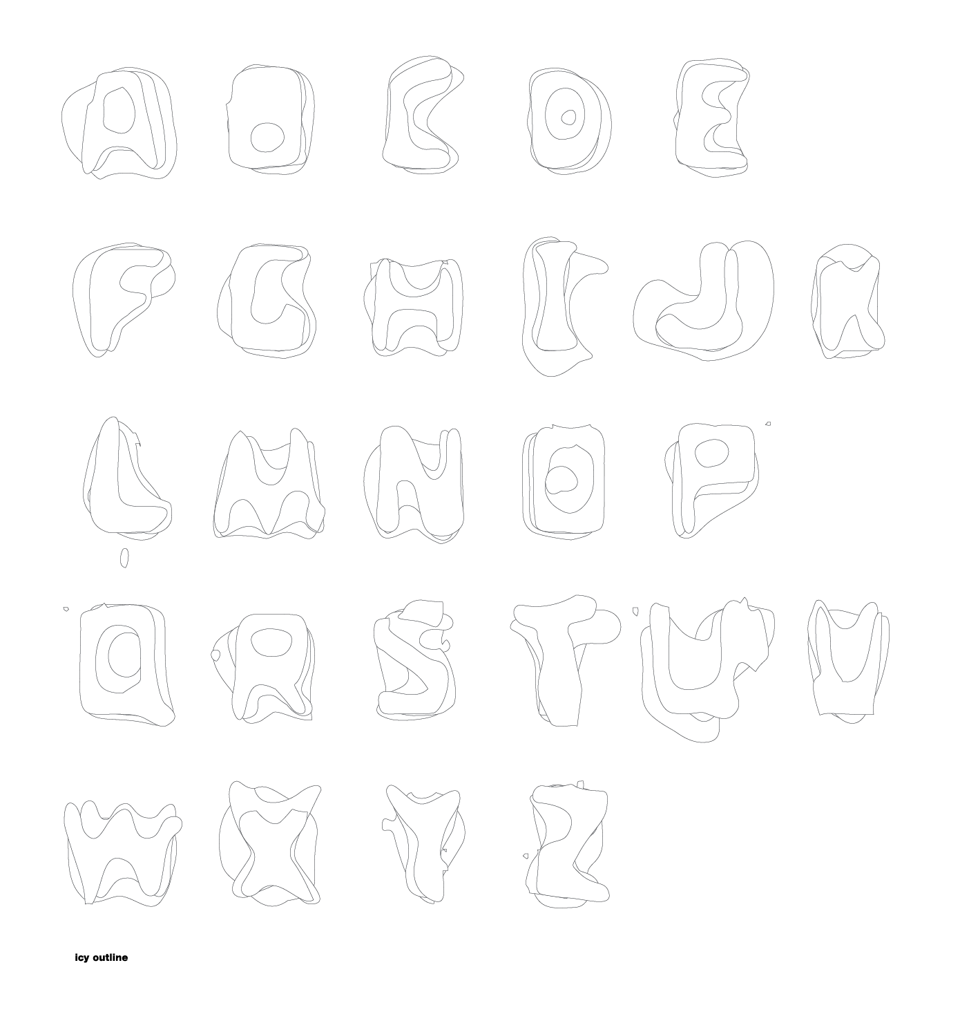
Sharon’s research into typography examines the visual manifestation of language through experimental form. Through investigations in materiality as well as textual expressions, she explores outside the customary concerns of aesthetics and legibility. Discoveries — made in acts of craft and documentation — are utilized to heighten the communicative experience of language. She employs three-dimensional type-objects (and in this case, their imprints) to develop contextual two-dimensional works, including type design. Using uncommon means to make language visible, the intent of this work is to reach beyond the cognitive to the emotional, and past the functional to the performative.
Combined with an interest in mutability, her work in two-dimensions is influenced by the work of Francis Picabia, El Lissitzky, and others who experimented with unconventional typography in a then-prevalent print culture. Confronting the boundaries of letterforms and word shapes, Melt is an exploration in experimental typography using ice as a morphing medium. Letters are molded in dyed frozen water, melted to cast imprints on watercolor paper, and graphically translated as a font for use in digital media. Meltings are made multitudinously in timed intervals to record the nature and variety of changing form. Weight and width variations of the resulting font families are indicated, not by typographic conventions (light/regular/bold), but by melting time (90 sec/180 sec/360 sec).
Recognition:
STA Award, Annual Gala exhibition (Chicago) and publication
Chicago Design Archive Induction
UCDA Award of Excellence, Archive Induction, Design Conference Exhibition (Boston)