Outlying
Outlying is our solo show representing investigation in two areas: outlying design form and outlying design content. Outside of common design practice and, in some cases, common design formats, the works developed for Outlying stem from personal interests in and notions of identity and popular culture, whimsy and improvisation, as well as experimental work with language and typography. Examining form, the works lean outward from standard graphic design practice to areas that are uncommon or blend with other disciplines. Examining content, the works focus on design itself as subject matter. Outlying was organized by Jean Carey at Seerveld Gallery, in the greater Chicago area.
Flip-pant | Star, Pyramid, Rectangular Prism
Flip-pant combines traditional Filipino craft-based making with the shapes associated with instruction in design fundamentals and colors associated with print production. It presents the traditional star shape as well as new forms, facilitated by modifications made to the core module shape. The word Flip, defined as turning something over, is also an anti-Filipino term and sentiment but has been widely reclaimed by Filipino-Americans.
Corruptions
Disrupting the norm, and embracing notions of randomness and improvisation, these works were generated by utilizing a glitch method for transforming and augmenting pre-existing compositions. In contrast to the digital nature of the process, some results have lead toward outcomes that exhibit seemingly painterly or analog characteristics, traversing its origins. More…
Meta Memes
Meta Memes explore the recognizability of the typography and language associated with memes. The language often consists of well-known dialogue quips from film, television, and social media. The typographic style is so familiar that a meme is still recognizable as such without an image, which typically accompanies it. Additionally, this project, situated in a gallery, is a work that explores dissemination methods by showcasing low design memes in a high art space.
Viva Grammar
This work intends to highlight quirks in grammar through the use of humor and a ubiquitous medium (tee shirts). It explores methods of dissemination (and flipping them). As its premise, grammar awareness is extended (from the textbook, formal classroom setting, and school-age years) to the everyday and through the informal vehicle of the commonplace tee. Disregarding the status quo, these tee shirts, considered to be simple lowbrow clothing, are presented in the highbrow setting of a gallery.
Type Prêt-à-Porter / Dress Type | Collaboration with fibers and textiles artist Nora Renick-Rinehart
Type is utilized to form the main structure or feature in clothing items — items of color and style, which comprise aspects of an exterior face, or outward identity. The color palette is CMYK (cyan, magenta, yellow, and black), the colors of ink used in printing presses and other forms of print production.
Recognition:
STA 100 selection
Crossover
Crossover showcases the images of a cross-disciplinary practitioner (the photography of a designer) and explores the restraints of an automated printing process and the series of serendipities it can yield. Additionally, the definition of crossover, as transcending borders, is an underlying reference to Outlying’s topic of pushing past boundaries as well as an attribution to our immigrant origins.
The images in Crossover can be viewed in three ways: one half of each image on separate spreads and then as whole images when page folios are spread apart and reveal that each image crosses over the gutter area of the page layout. In the spirit of the Surrealist exquisite corpse game, the spreads yield unexpected combinations of image pairs.
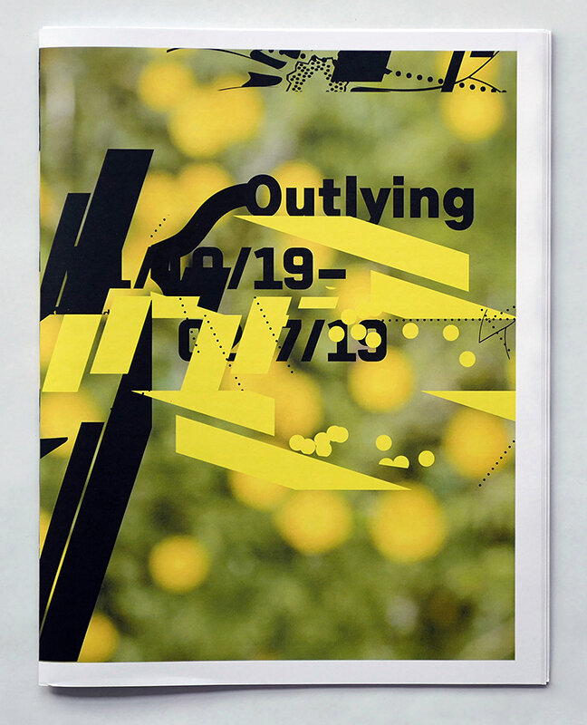
Outlying | Post-exhibition publication and design
Recognition:
Muse Creative Gold Award
NYX Silver Award
American Graphic Design Award and published in Graphic Design USA
Creative Quarterly Runner-up